Guía de OJR “cinco” a la prueba de la utilidad del Web site hágalo usted mismo (do-it-yourself website)
Entrar en el interceptor aerodinámico -- la persona que pronuncia las palabras la “prueba de la utilidad.”
“Porqué incomodidad?” piensas. Los trabajos del sitio, lo sabes. Lo has estado demostrando a tus colegas de la redacción a lo largo de la manera. Has escuchado su regeneración. Te has hecho los cambios que el pensamiento era necesario. ¿Qué más podían tú aprender?
¿Qué más? ¿Cómo cerca de 80 por ciento de los problemas con el paquete? ¿Cómo sobre defectos de la arquitectura nunca considerabas? ¿Cómo sobre las diferencias entre un buen diseño y gran?
Como los informes de Technology's Untanglers from July 8 New York Times reports, “a veces hay una desconexión enorme entre la gente que hace a un producto y a gente que lo utilicen.” La prueba de la utilidad es vital a destapar las áreas donde suceden éstas desconectan. Su valor y energía no se deben subestimar en el mundo del e-comercio o en el mundo storytelling del periodismo de las multimedias.
Pero tiene que ser hecho a la derecha con una metodología que trabaje y considere los plazos apretados de un periodista. Eso es sobre cuál está esta columna. Proveeremos hoy de ti una plantilla que haga la utilidad que prueba menos desalentador. Todo lo que necesitas hacer es:
- personas del recluta CINCO
- poner CINCO horas a un lado (que es el tiempo total, comienza a acabar)
- seguir los CINCO pasos descritos más abajo.
Ahora en virtud de una mejor lectura y dado a las criticas que recibí por mi PÉSIMA traducción del articulo anterior, dejare en ingles lo que viene!!!
FIVE PEOPLE
It is important to realize that when done correctly, usability testing with five people can uncover 80 percent of your problems, as demonstrated in the chart below by usability guru Jakob Nielsen.
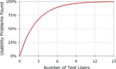
Jakob Nielsen's chart from his March 19, 2000 Alertbox Column. http://www.useit.com/alertbox/20000319.html
Moreover, usability testing is the difference between good design and great design. As we've said in the print world for years, if the presentation is aesthetically pleasing, but the user can't find the information, then the design is useless. This concept is even more important in the world of Web design where clicking to a new site is even easier than finding a new magazine or newspaper.
What exactly will this accomplish?
That's up to you. A properly executed usability test of your multimedia package or Web site can reveal answers to whatever you design the test to ask. However, in most cases it will uncover three key things:
- Areas of confusing navigation. There is no doubt that as the project designer, you know how your site navigation functions. You know the "Part Two" menu option brings the user to a particular story or audio slide show. But does the new user know this? It is important to realize that about an hour into designing your project, you may have lost all perspective on how the interface appears to others. This also holds true for your colleagues who have been looking at the project as you have been creating it. You all have learned your navigation; you have conditioned yourselves to go where you want. But for others it may not be so easy and intuitive. You need to test and see.
- Users' intuitive viewing sequences. Again, this is an area that designers tend to have in mind and follow as they work on or show the site to others in the newsroom. A usability test can reveal if others will follow what you intend.
- Roadblocks in the flow or delivery of information. Not everyone in your target audience may know that the e-mail for the reporter is at the end of the text or that the panoramic photograph moves when the arrows on either side are clicked. What seems normal and natural to the creator is not always so with the user.
FIVE HOURS
What! Who has that kind of time? Although it may seem daunting, think about the hours you've already put into the project. If simple changes you make can help the user actually understand the project better or more completely, isn't it worth it?
The testing method outlined below is a combination of suggestions from technology experts, journalists and usability professionals and is created especially for the busy multimedia journalist. It not only focuses on issues specific to the types of site or package designs we do, but it also takes into account newsroom deadlines. So from start to finish it should take one person about five hours to get solid usability data about your package. Here's the breakdown:
- 30 minutes to meet with project team and determine key questions
- 30 minutes to add your specifics to the basic pre-and post-surveys provided
- 30 minutes to recruit test subjects
- Approximately two and half hours to test five people for 20 minutes to a half hour each.
- 30 minutes to analyze data
- 30 minutes to summarize the results and create a task list.
This testing is leaner and more streamlined than an expensive one designed by a usability firm, but it has been put to the test by my design students on award-winning multimedia news packages as well as journalistic Web sites for the past three years and has delivered valuable data each and every time.
Before you start....
- Check your ego at the door and separate yourself from your creation. If you don't think you can do this, have someone else on your team handle the testing. No doubt you have an emotional attachment to this project that has consumed you for the past months. That's only natural. But objectivity is necessary to get test results that will make your project even better. Be sure you want the real answers.
- Realize the limitations of the information you are gathering. Usability tests can reveal valuable information a particular project, but the results should not be misconstrued to as pertinent to all Web presentations. Here is where that number five (in terms of test subjects) is too small and your test design is too specific. The test results are helpful for the project you are testing. When you do another project, you'll need to do another test.
- Know it is OK to ask for feedback. As journalists we have been trained to NOT go back to sources and show them stories beforehand. Remember that this is different. We are asking an uninvolved group (not the story sources) to do what they normally would do with a Web package. Then we are taking that information and improving the site. It essentially is another step in the information gather process.
FIVE STEPS
What follows are the basic steps and considerations for creating and executing a test on your multimedia news package.
Step 1: Determine tasks to test Call a meeting of the project team and:
- Review. Remind everyone of your target audience and site goals.
- Choose tasks. Determine at least ten (but no more than 15) tasks that you a user should be able to successfully execute to get the most out of the package. Remember, you cannot analyze the entire presentation. Carefully select tasks based on what actual users of the site would do. These could include items such as finding and playing an interactive game you created, watching the audio slide show through completion or navigating the site in a specific, preferred order. Here's a good list of questions to help.
Step 2: Experimental design 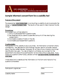 Although there are multiple ways to design a usability test, we are providing you with a basic design that has been proven to work on multimedia news packages. As you become more experienced in testing you may want to deviate from this outline, but we strongly suggest you follow it exactly your first few times.
- Welcome, complete informed consent and pre-experiment questions. It is important you do your best to put users at ease by thanking them, offering them a cup of coffee, or just chatting with them for a few minutes. Remind them that it is the multimedia package that is being tested, not them. You then will want users to read and sign an informed consent -- where the experiment is explained for the test subjects. This is necessary to ethically complete this inquiry. Finally, you will want to have them complete the pre-experiment questions that you will develop in Step 3. Time: 5 minutes
- Free observation time. This is a time when users explore the site with NO interaction from the tester. You simply direct the user to the site and step back. The only instruction should be for users to "Explore the site for as long as they would like." Here is where you can either videotape their behavior or take copious notes. You want to know what users do when just directed to "explore." Allot 10 minutes total, but if the user tells you he or she is done beforehand, move along. If they are not done at the 10 minute mark, make note of that and tell users it is time to move on.Time: -5-10 minutes
 Assigned tasks. Using the list you created in the step above, ask users to execute your preferred tasks. Word the tasks so that you are placing users in a natural scenario. For example, rather than stating, "Find the e-mail for the reporter," say something like, "You have an unanswered questions after viewing this presentation and would like to contact the reporter. How would you go about doing that?" Have tasks ordered and prioritized, skipping over any that were completed during the free observation time. Depending on the user and the task you may or may not want the user to "think aloud" or describe their thought processes to you while completing the tasks. At this point in your testing, either silent observation or think aloud protocols are fine approaches. Do whatever feels most comfortable to you. Time: -5-10 minutes
- Post experiment questionnaire and discussion. There are two parts to this stage in the process. First, have users fill out the questionnaire you will develop in Step 3. Once complete, it is time for open-ended questions that are answered in a conversation with you.
Step 3: Develop questions There are four printed forms you will want to have ready for each test participant:
- Informed consent. Necessary for ethical completion of the study. Sample here.
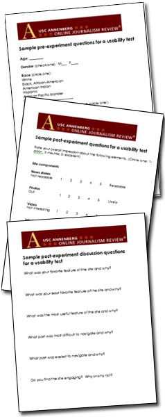
- Pre-experiment questions. The purpose here is to give some context to the results and help you understand the Web practices of your test subjects. As the sample form suggests, you want to have users quantify their responses and word questions so that the subjects' personal interpretation of the answers is minimal. For example, instead of asking a user to describe their Web usage on a scale of 1-10, with one being none and 10 being heavy, it would be better to ask them to quantify the amount of time they spend online and provide choices such as 0-2 hours/day, 3-5 hours/day, etc. You also may want to ask questions that gauge the participants' interest in the subject of the presentation you are testing, or the Web site your work for. Make this a written questionnaire. A sample can be found here.
- Post-experiment questions. You will want to administer a written questionnaire once the tasks are completed. This questionnaire should gather subjective data, and should contain quantifiable inquiries, asking users to rank the success of certain aspects of the site. A sample can be found here.
- Interview questions. Finally, plan a few open-format interview questions to ask each participant at the end of the session. These should elicit more overall, qualitative impressions of the website. You also may want to ask participants what they recall about how the site functions. If they clearly recall the structure, you can bask in the glory of your success. If not, you may want to consider where clearer labeling or directions may help. Users should not write these responses. You should allow them to speak freely and take notes. A sample can be found here.
Step 4: Gather data The order of data gathering is outlined in Step 2 above. Here are items to consider before you begin with the first test subject.
- Test sooner rather than later. No multimedia designer wants to make changes to something they believe is in its final form. Schedule your usability test in the beta stage of development -- not quite finalized, but final enough so someone can navigate the site.
- Do not test your newsroom colleagues. Anyone already familiar with the project does not represent your typical user. In an ideal world, test subjects are recruited through a marketing research firm, but -- for the busy newsroom journalist -- this probably isn't possible. So go to other departments. See if someone in ad sales, circulation or marketing (who doesn't know about the project) can spare a half hour to be tested. See if a friend or relative of a colleague can come in. Bottom line, try to make your test subjects as close to typical users as possible.
- Test everyone on the same computer, in the same location. This will standardize the results and not allow people's bookmarks or other preset browsing options interfere with results.
- Know what you are looking for during the free observation period. Carefully observe each session and take notes about the participants' interactions with the site. Which tasks were performed successfully? How long did they take? Did participants make errors? What problems occurred? Did the participants have a conceptual model of the site? Was it correct? It can be helpful to have a checklist for yourself during this time, so you observe the same behaviors with each participant.
- Pay close attention to the steps users take to complete tasks. You want to discern the path that is clear and most natural for users when completing tasks. Ideally they all will complete tasks in fairly predicable ways. But if they do not, you can learn something by the "mistakes" they make. How do they recover? What page of the site do they go back to as a "home base" or starting point? Again, you may want to have your own checklist to refer to here.
- Try to be as unobtrusive as possible. We know... you feel like an elephant in the room when observing someone viewing a website. But awareness of your body language and your non-verbal reactions to the users' behaviors can make a huge difference in terms of their comfort. It will take them some time to get used to your presence, but once they do, they will become more relaxed and their behaviors will be more realistic and natural.
Step 5: Analyze data and make list of potential improvements
Now the fun starts -- seeing what you have learned. Again, take things step-by-step:
- Average all quantifiable responses. Break down the number of men vs. women, the average age of participants, etc. Be sure the demographics match your target audience. You also will want to average the answers to all questions that involve rankings. Place all this data on one sheet and make notes of responses that fall to either extreme.
- Look at the free observation notes in light of the quantifiable data. If users ranked navigational controls as weak, what behaviors during the free observation period support this? Can you find similar behaviors that would contribute to this ranking? Were there any non verbal cues that indicated their frustration at during a certain process? Sighing? Trying to click off the site? Gather as much supporting data for each ranking
- Look at the success/failure to complete usability tasks in light of the quantifiable data. Again, go back and see what common behaviors were exhibited by the users when asked to complete certain tasks. Did they become confused at the same points? Did they all sail through certain tasks? You will discover that their site rankings will correlate with their experiences completing tasks.
- Make a list of at the top three things that should not change and the top three things that should. You are on a deadline, we realize that. So be sure to make note of what is working and why. Write down the top three things you did well based on this usability test. Then make a list of three manageable changes to make.
- Look at user suggestions for improvement in light of the changes you need to make. Your users aren't designers or interface experts, but their gut reactions can help you determine where to put your professional energies. See what they said they want and find a design solution for it. Again, keep things manageable. You aren't going to fix everything, but you are going to tackle the top three you listed in the step above. Do everything you can to address the problem areas, and -- if possible -- check in with the users and show them the solution.
BOTTOM LINE
Usability testing is a skill that -- just like design and programming -- you improve the more you practice it. Once you've done this a few times you'll find you can use it on the fly when you get into those disagreements about interface design issues within your department. At UNC, we resolved a design issue on a project in Chile this past March. We were working with students from Universidad de los Andes and could not come to a consensus on our secondary navigation. So, we did a quick usability test with audio reporters and photographers who were in the newsroom, but who had not been involved in the design process. What we found was that the design team was split over two equally ineffective navigation methods. It forced the team to rethink at a more basic level and resulted in a much improved solution.
So remember, that person who suggests usability testing isn't the spoiler, but really your friend -- and the friend of your audience.
ADDITIONAL RESOURCES
Don't Make Me Think
This is an excellent book by Steve Krug. It should be on the desk of every multimedia news designer.
Step by Step Usability Guide
Part of the site usabilty.gov, this diagram is a good visualization of the testing process.Usability Testing Guidelines
This piece provides a simple tutorial for a general usability test and includes some insightful tips.
Ahora bien, es interesante lo que se experimento en la Universidad de los Andes (que pena enterarme de otra fuente que lo hicieron) en fin....
espero que si se entienda bien esta ves.


No hay comentarios:
Publicar un comentario